CoinDesk needed
a visual identity.
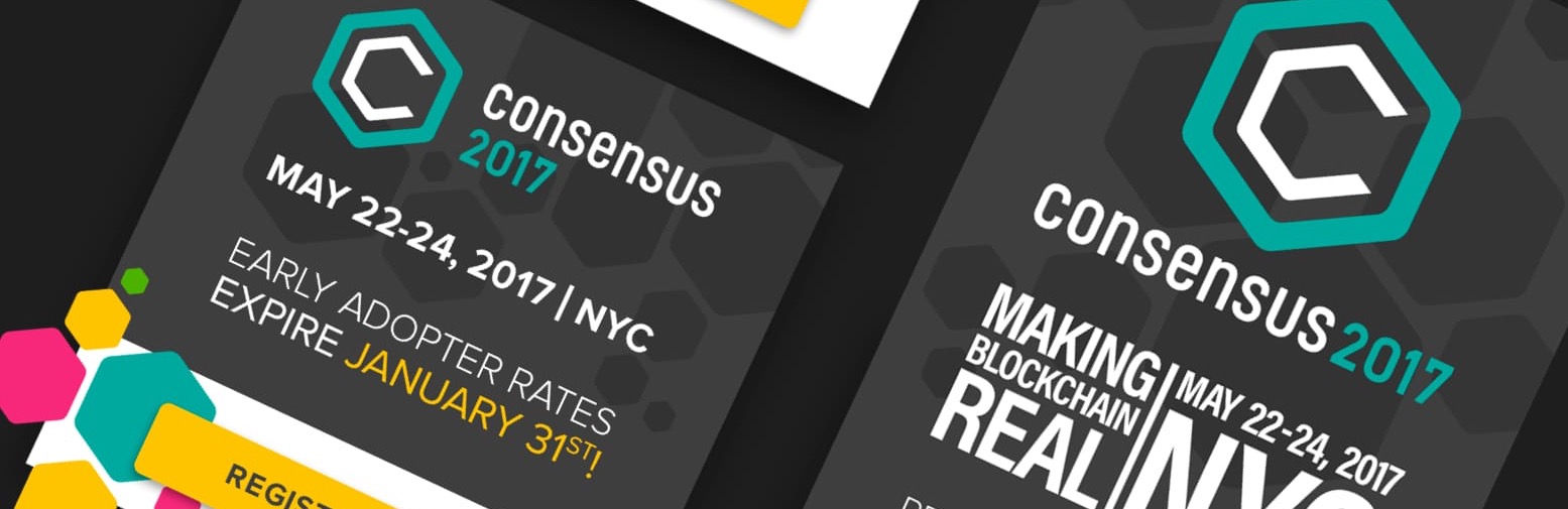
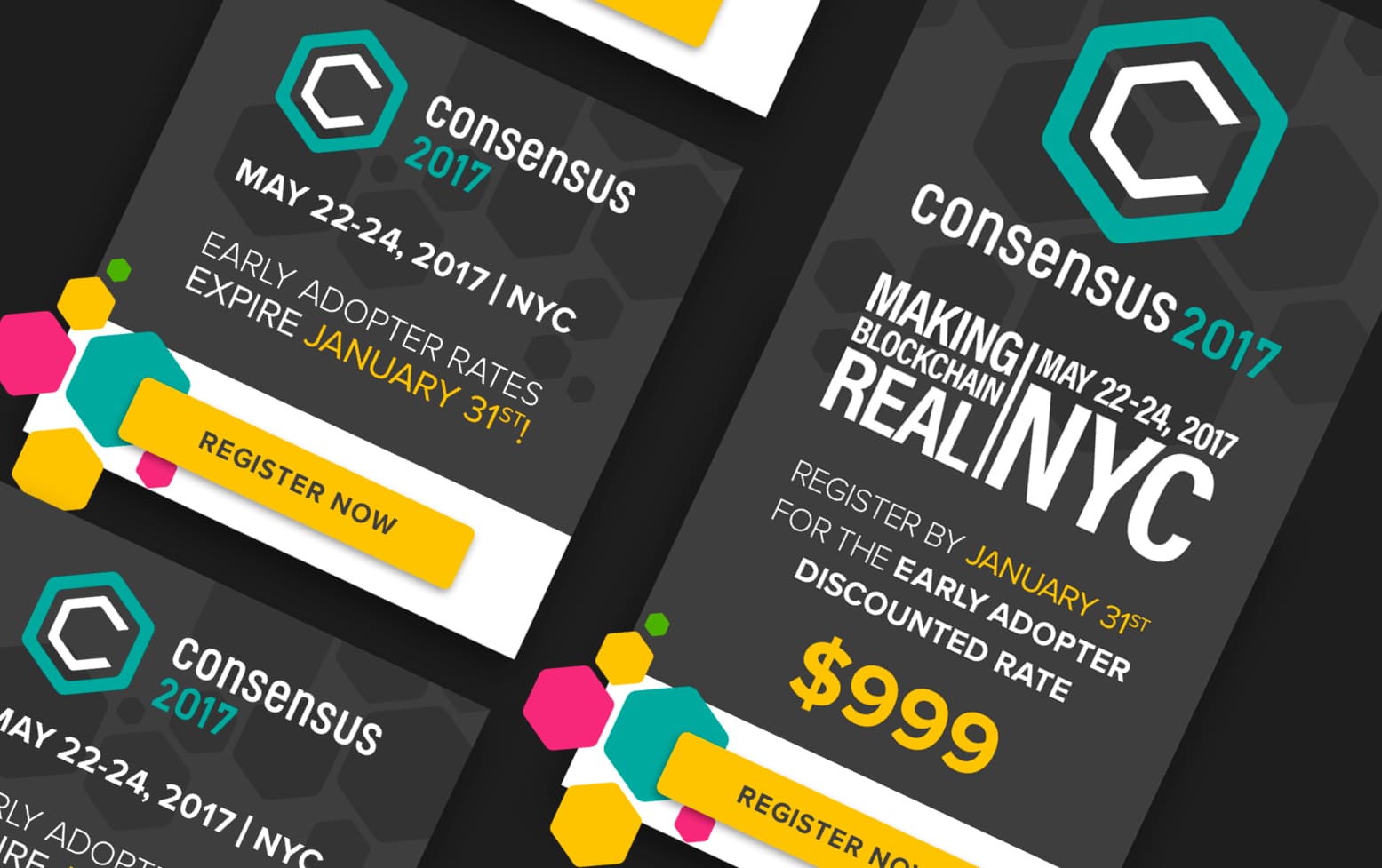
In 2016 CoinDesk was a bitcoin news site with a conference attached. We drew the masthead, wrote the style guide, designed the site, the app screens and the newsletter, and built the event brands for Consensus and Construct. Consensus is now the week the industry plans its year around.
It had to be believed
more than it had to be liked.
The sector it reported on was one where most of what was written turned out not to be true. The mark we drew was going to sit above headlines about other people’s money. That is the whole brief, and everything below follows from it.
So we made it boring on purpose.
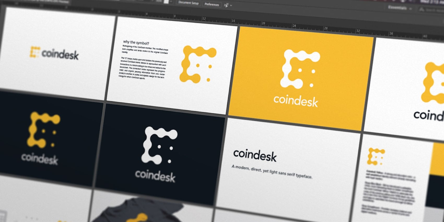
Four named routes were explored in parallel: chain, morse, bubble, stacked, each packaged with its own PDF and its own font report. One was printed onto a shirt on 2016-08-11, before anybody had picked a winner, to see whether it survived on cotton. What shipped reduced to yellow and near-black, Avenir over Proxima Nova, and a rule that the logo gets fifty pixels of air no matter what.
Then it kept going: the news site and the mobile app, the newsletter, and the event brands. We did CoinDesk’s web and app product design, and we developed the Consensus branding and the support for their first shows in New York. Consensus is now the week the industry plans its year around.
We made their brand then developed Consensus branding and support for their first shows in New York. We also did their web and app product design.
Phil · Innovation Theory, on the record
Two event brands, a masthead,
a site, an app.
We wrote the rules.
Thirteen versions, three years.
There are no predetermined sizes for the logo. Scale and proportion should be determined by the available space, function, and visibility.
The rule that survived thirteen versions
Hexagonal mark was tilted 60 degrees, causing the shape to appear like it is balancing on one corner. (This suggests a three-dimensional cube shape, further representing the ‘Blockchain’.)
The 2016 evolution, in our own words
For questions about art direction or branding regarding Consensus 2016, please contact: …
The client’s own brand book, telling people to call us.
Not all of it held.
We branded an event that never got a campaign.
Construct and Construct 2017, marks and slogan lockups, all finished the same day as the Consensus set. Black and white reductions for lanyards and embroidery followed on 2016-12-15. Then nothing. No campaign assets, no prospectus, no event collateral anywhere in the folder.
Eight screens. No proof they shipped.
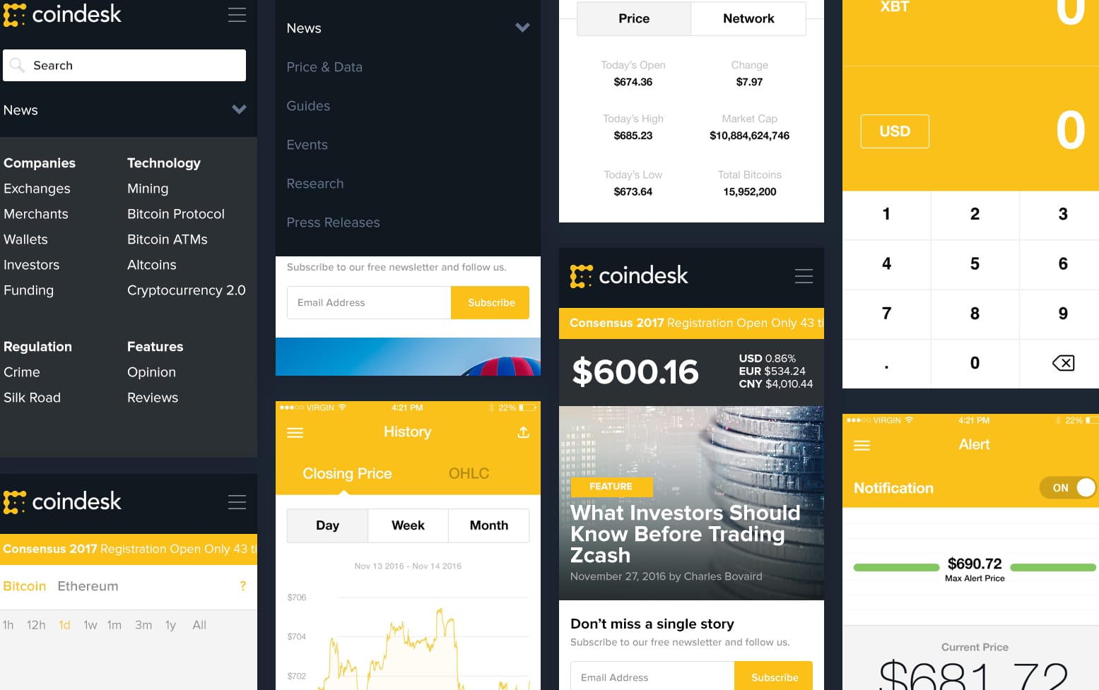
Loading, home, open nav, charts, latest news, article, calculator, alert. Device mockups, a Sketch source file, a clean numbered sequence. Every one carries the same status bar: 4:21 PM, 22 percent battery, the same carrier, because it was cloned across the whole sequence, which is what a designer's hand looks like when nobody is meant to notice.
We designed it. We cannot show you the traffic.
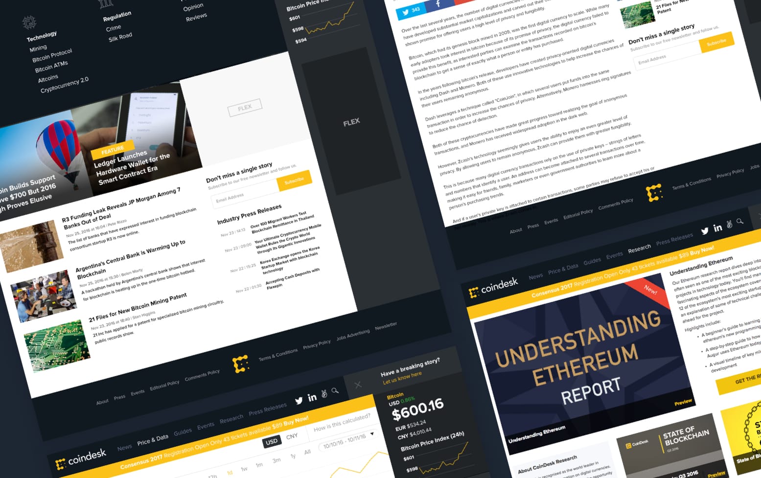
Seven wireframes, then comps, then a responsive set, packaged for handoff on 2017-01-17. Six of those boards were flattened and put in front of CoinDesk’s board on 2016-12-02.
It is still recognisably the thing we drew.
Yellow and near-black, the lowercase wordmark, fifty pixels of air. A brand book that was still being revised in 2019 is a brand book somebody was still using. The Consensus hexagon is the half that did not last. We tilted it sixty degrees so it balanced on one corner, and it balanced there through the years the event became the one people plan around. Consensus has since retired it. Event marks get shorter lives than mastheads. That one had a good one.
Consensus 2016 drew 1,500+ industry professionals. For 2017 CoinDesk projected 2,000+ attendees, from 800+ companies, across 35+ countries.
Those are CoinDesk’s own figures, from the sponsor prospectus we designed. The same document logs the 2016 livestream at 5,600+ unique views averaging eighteen minutes, and their email list at more than 30,000 active readers. Consensus 2016 attendees came from Deloitte, Microsoft, IBM, CME Group, Amex, Barclays, BNY, Citi, E&Y, Fidelity, Intel, JPMorgan, MasterCard, Nasdaq, PayPal, PwC, Santander, TSYS, Visa, Wells Fargo, and USAA.
Ten years on, Consensus is still running.
Checked 2026-09-06: consensus.coindesk.com is live and selling Consensus Miami 2027. We built the event brand for the New York shows and the event outlasted the decade, the venue and the city. That is not our claim to make about our own work. It is a page anybody can open.
Brand · event identity · website · mobile · newsletter · campaign · 2016 to 2019 · engagement type: BRAND
What the folder holds, and what it does not.
This page is built from the CoinDesk project folder. Dates are file dates, July 2016 to June 2019, unrounded and in the order the files carry. Where the folder and the memory disagree, the folder is what is on the page.
What the records cover. Design output: the four masthead routes, the style guide and its thirteen versions, seven wireframes, eight numbered app screens, six board comps, the newsletter template, the Consensus and Construct brand sets, and the 2017 campaign drop. Every line quoted in We wrote the rules is verbatim from documents we wrote and the client published. Nothing is tightened, including the misspelling.
What they do not. The oldest Consensus file we still hold is dated April 2016, two weeks before that year’s conference; the earlier material is not in this drive. Phil was in the room for the first shows and the drive was not, which is a fact about the drive. For the mobile app there are no build artifacts, no store listing and no download numbers. Designed is provable, shipped is not, and we are not claiming it. For the website there is no analytics, no launch date and no record of which comps went live. If someone wants numbers about what the redesign did to the business, we do not have them and will not invent them.
Unverified. Our own portfolio page says this began with design workshops and competitive research; no workshop deck survives. The attendance, livestream and mailing-list figures are CoinDesk’s own, from the sponsor prospectus we designed: the client counting their own crowd. The Ted Rogers quote is about the conference, not about us.
About the images. The master mark and the environmental-scale mark are our own case-study crops, already colour-corrected for web, not fresh exports from the source library; the environmental one is a rendering, not a photograph of a CoinDesk building. The one-artboard system shot is caught inside the working Illustrator file rather than exported from the book.
How AI would help
this now.
Everything above this line is in a file somebody can open. Nothing below it is. This is how we would run the same engagement today, with AI in the work, written as an opinion, because that is what it is.
The four masthead routes took three weeks; a model explores forty in a day and packages each one with its own type report. Thirteen guideline versions maintained across three years is now a job you can partly automate: the book checks itself against the artwork, and the typo we shipped in the FINAL gets caught before it ships. The site, the app screens and the newsletter template would come faster, and the campaign drop, six heroes, banners, skyscrapers, countdowns, a Mailchimp header, is the single most automatable thing on this page.
It would not have told us to be boring.
The brief that mattered was a judgement about trust: this mark was going to sit above headlines about other people’s money, so it needed to be believed more than it needed to be liked. A model optimises for interesting, because interesting is what the training data rewards. Forty routes is more useful than four only if somebody can look at the interesting ones and say no.
Building in crypto now? See what we do for blockchain teams today