Ten steps became one screen.
Then it became a decade.
ShapeShift was Erik Voorhees’s idea: move one crypto asset into another with no account, no order book, and none of the ritual every other exchange demanded. We led the UI/UX and the front end build, working directly with Erik and the backend team to work out the flow and the endpoints it would need.
The design was the product. ShapeShift came under the shop’s wing in 2013 and launched out of our office; the concept work ran through 2014 and the product went live in the summer of 2015, running at more than a million transactions a day at peak. The work then ran another five years: a partner portal, two brand systems, a token membership product, and a six step security check for a hardware wallet.
Nobody signs
a decade.
You get re-hired, one surface at a time, by people who watched the last one hold. He called again years later for the Valhalla project on THORChain.
One deliverable from that decade is not a screen. The 2018 brand manual is a full identity book: primary and secondary lockups, a single-colour exception for embroidery and etching, three blues, Nexa as the brand face with a custom i and f, and a rule for the fox's tail: blue shadow on white, all white on dark. A rule that specific only gets written by whoever has to answer for the artwork.
We never held the keys.
That held for the whole decade: the company never touched customer key custody. Key ownership would all have fallen on us, so we stayed a service company, not a product owner. Knowing what not to own is part of the job.
The problem was never crypto.
It was the ritual.
Legacy exchanges took about ten steps to complete a transaction: an account you did not want, a screen of numbers you could not read, and sometimes an order that sat unfilled for hours. The research said people were tired of all of it.
This is what a traditional exchange looked like, and still kind of does today. It was very utilitarian, lots of graphs, buttons, fields, and numbers. It took about 10 steps once all is said and done to complete a transaction. The process was slow, complicated, and sometimes your order wouldn’t even be filled for hours.
ShapeShift Case Study · Phil’s writeup
Most people did not want to create an account to just exchange an asset. They also didn’t need to see all of the information displayed at one time.
ShapeShift Case Study · from user interviews, by survey and in person
What information or tools did the user actually need and when did they need them? What could be obfuscated while still providing the necessary information to understand the process? E.g. (did they need to see the miner fee before selecting their trading pair?)
ShapeShift Case Study · the question that decided the flow
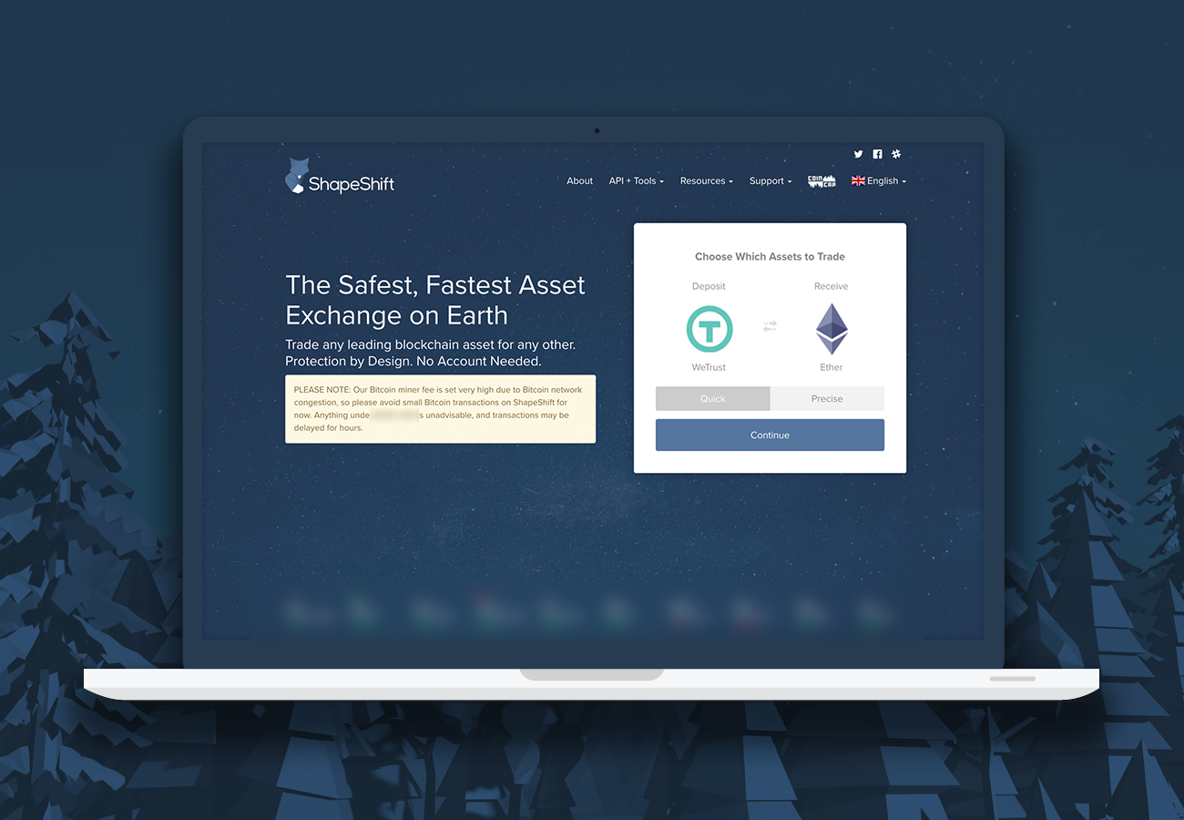
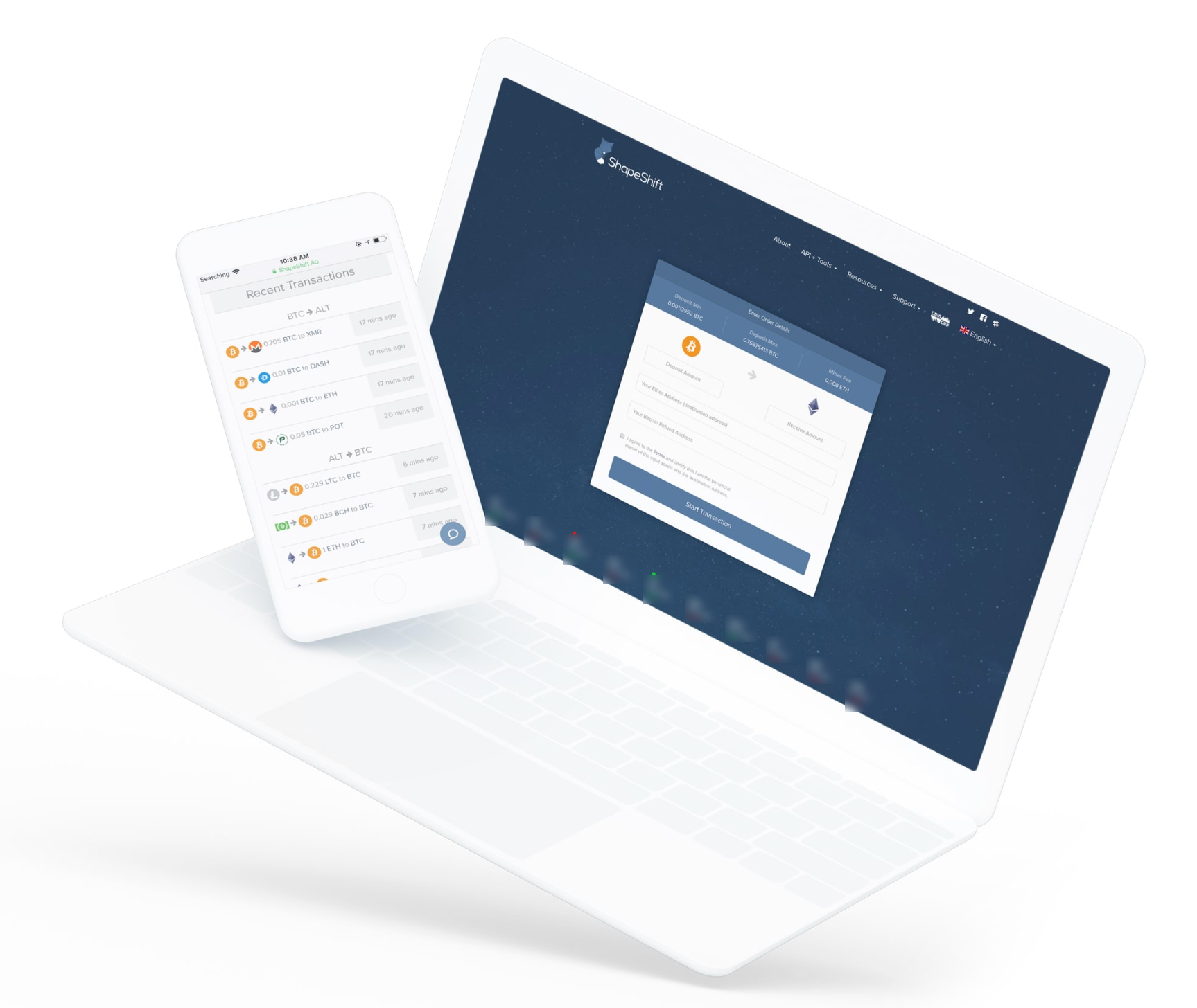
More than a million transactions a day, at peak.
The chosen design separated the flow into discrete, manageable steps, and helped users to absorb complex information in bite size pieces. This gave users confidence in the process and trust in the platform, creating a dedicated and passionate user base.
ShapeShift Case Study · Phil’s writeup
This UX pattern that we created is now commonplace in the crypto currency space, and ShapeShift remains a pioneer of well designed products with a user-centric focus.
ShapeShift Case Study · Phil’s writeup
The flow was the visible half.
Coin support was the other one.
Everything above this line is design. It is not the whole engagement, and the reason it looked like the whole engagement is that design files survive and code does not. Our own published account of this work names the rest, and it is worth quoting rather than paraphrasing.
Our team worked closely with ShapeShift to integrate support for a wide variety of digital assets, streamline the onboarding process, and continually refine trading features.
The published ShapeShift page · innovationtheory.com
Widening what an exchange can hold is plumbing, and the plumbing is the product.
Every asset a user can swap is an integration somebody had to write, test and keep working while the asset’s own network changed underneath it. Nobody markets that. It is the difference between an exchange that supports six things and one that supports the thing you actually own, and it is the same job we were doing on the other side of the building: the KeepKey indexing services that widened what the wallet could hold. One family of work, two products.
The published scope also lists mobile and dApp development, a token launch, and business development alongside the product and design work. The FOX membership build further down this page is the design half of that token; the launch itself sat in the same engagement.
This section is sourced from our own published portfolio of the engagement.
Twenty screens, delivered
2017-09-19.
The Partner Portal moved the same discipline from the consumer flow to the business one. Two partner types, Referral Link and Partner API, sorted by a three question partnership questionnaire that routes a prospect to the right tier. Then account creation with mandatory 2FA, organization verification with document upload, an approval hold, API key generation, a dashboard with per asset volume and a live transaction ticker, filterable reports, user roles with an audit log, and a payout flow.
Paste only. No typing.
“BTC Payout Address: In order to ensure that you are pasting in the correct address, you can not type in your payout address. Instead, copy your desired payout address and paste it in here by clicking the button below.” A mistyped Bitcoin address is unrecoverable, so the input refuses the failure mode instead of validating it afterward.
“WARNING: You should write your API secret down. You will not be able to access this API secret again, so make sure it is safe!” One time reveal, stated in the sentence where the user can still act on it. The account settings screen carries the other half of that thought: an API key freeze.
Sorting is a design job.
Referral Link and Partner API want different things and deserve different funnels. A three question router puts a prospective partner into the correct one before they fill in anything they will regret. The approval hold is told plainly too: “we will notify you of your approval in 2-3 days.”
Who changed what, and when.
The payout flow keeps a withdrawal address change history, and user management keeps roles plus an audit log. When something goes wrong at a partner, that history is the first thing anyone asks for. It is a screen you design before the incident, not during it.
We hit the date.
Twenty-four days, brief to live.
2018 was the year the FOX token became a product surface. The mobile membership integration was briefed 2018-09-07 with a hard October 1 deadline: OAuth through the membership portal, 2FA before entry, shifting blocked until verification is complete, FOX Back status on every shift, and the old app switched off. Copy was specified down to the line, including “Congratulations! You’ll be earning FOX back on this shift.” The apps went live on time. Then we wrote down what it cost.
we had spent a good portion of the week of the 17th working on getting 2FA up and running as outlined in the creative brief and the application flow that I delivered on Friday, the 14th. it was not until Friday the 21st that we heard in the channel that the 2FA flow we had been developing on was incorrect.
Membership integration retro · 2018
We wrote the fix into the process.
The retro produced named stage gates that still run here: brief, scoping, charter, UX and UI approval, tech requirements meeting, testing and QA, handoff. Plus one rule with teeth, quoted from the document: “We need to ensure that any stakeholder who might dictate changes sign off on the UX prior to moving forward with the project/effort.” The FOX membership dashboard that followed, levels 2 through 5, unlocked and pending FOX balances accruing over a 30 day period, ran to that process from 2018-11-02 to 2018-11-29.
The same six sentences,
on two very different screens.
KeepKey work ran alongside ShapeShift: a 2017 brand system locking the logo lockups, a four color palette anchored on Pantone 382 C, Raleway, and hard minimum sizes so the mark never gets crushed. Then a white label spec that reads like manufacturing, because it is one: the device back at 38.0mm by 93.5mm, 79.5mm of width for a client logo, and the KeepKey mark at 8.5mm by 10.51mm sitting 3.5mm off the bottom right corner. That is the difference between a brand guideline and a brand that survives a factory.
Users struggle navigating the software.
That sentence is ours, written about a client’s shipping product. The review ran an expert walkthrough of every basic task, install, setup, add accounts, shift, send, restore, and named where each one hurt. It also flagged accessibility as a failure rather than a nice to have, and put TREZOR and Ledger side by side with real user comments.
Desktop and device, in sync.
A six step security check that fires the first time a user sets up the wallet, displayed in sync on the desktop client and on the device’s own single color screen. Eighteen screen designs across the Client and Hardware tracks.
So we shipped the hybrid.
“Results showed that, while technical explanations of each step were confusing to people with a high level of technical understanding, the simple explanations did not resonate as well with people either. We ended up creating a hybrid.” A short technical line plus one sentence of plain English, identical on both screens.
Stop using this wallet.
“I also created screens for when a check failed, and ensured that a user would have actionable steps if that situation happened and would not continue to use their wallet.” Most products design the success path and leave the failure to a toast. A hardware wallet does not get that luxury.
If you lose your key you’ve lost everything.
Phil’s own line from the writeup, and the reason none of this was decoration: “If you lose your key you’ve lost everything, its very important to understand that. Building trust.” Simplicity was the security feature.
Concept in 2014. Launched summer 2015. Still being re-hired in 2019.
about 10 steps replaced by a stepped flow · more than 1,000,000 transactions a day · 20 Partner Portal screens delivered 2017-09-19 · 2 partner tracks sorted by 3 questions · a 6 step device check mirrored across 2 screens · 18 screen designs dated 2019-06-14 · 5 FOX membership levels · 1 hard deadline, met
Ten years is a long time
to keep a vendor.
For over ten years, Innovation Theory has been part of the ShapeShift journey. They’ve helped shape the brand, the product, and the tech behind it. If you want a team that knows crypto inside and out, you won’t find better.
Erik Voorhees · Founder, ShapeShift
Years after this, Erik called again for the Valhalla project on THORChain.
One client.
Four products.
The exchange is the story on this page. ShapeShift also owned a hardware wallet, a portfolio market and a market-data platform, and we worked on all three.
We built the brand system in 2017, the year ShapeShift acquired the device, and it had to survive a factory as well as a screen. In 2019 we designed the six-step security check that runs the first time a wallet is set up: eighteen screen designs saying the same thing, in step, on a desktop client and a one-colour device display. The whole KeepKey story.
A tokenised portfolio you could build, fund, watch and rank against everyone else’s. We designed the five-step Create flow: name it, size it, allocate it, review it, fund it, the same stepped grammar we had built for the exchange, pointed at a harder job. Then ShapeShift brought us back to sharpen it, twice.
One of crypto’s best-known market-data platforms. We built the identity from the mark out: primary and secondary lockups, colour and white cuts, a full style guide, business cards, and iterated the interface three times inside a single week that October.
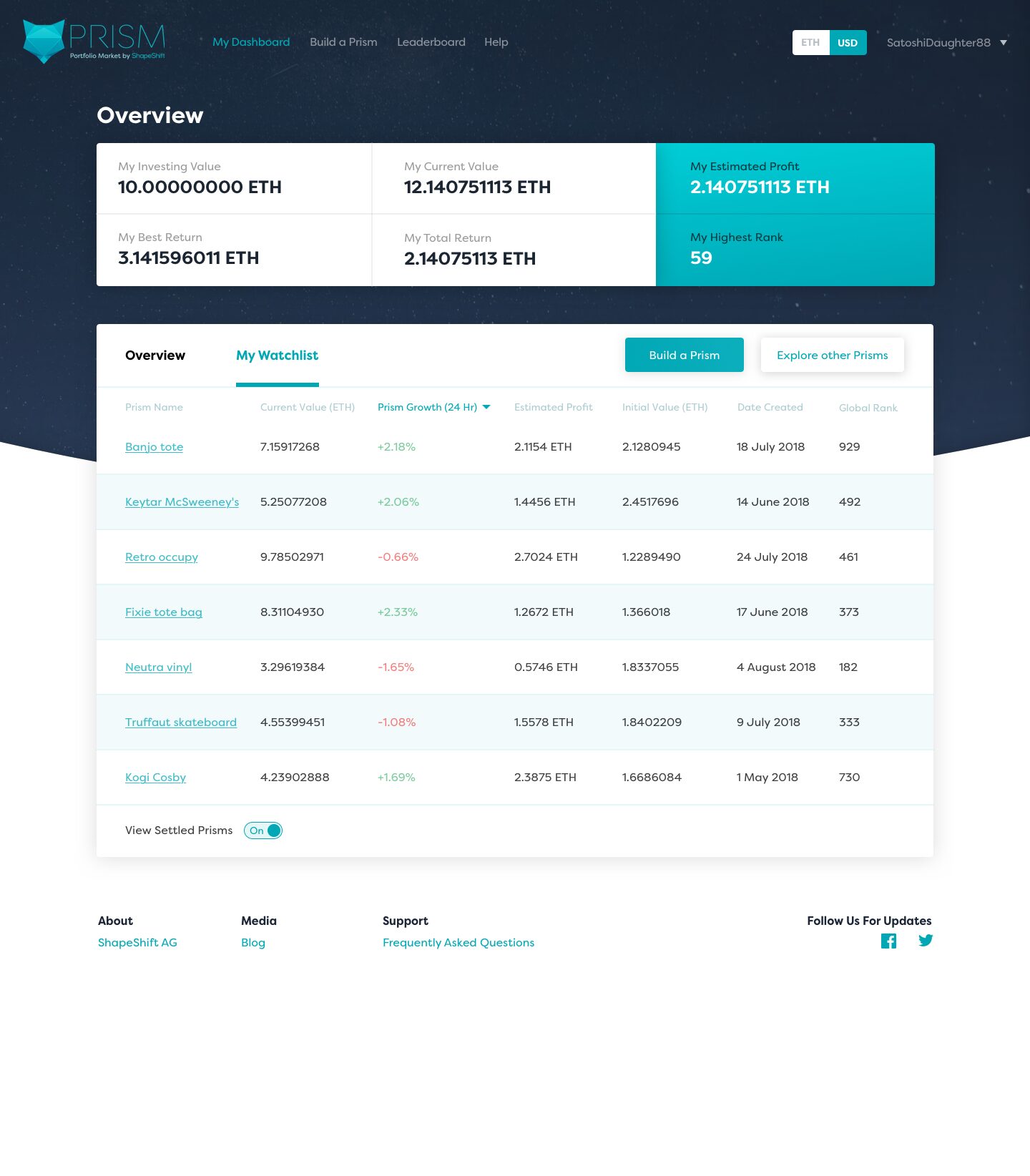
The card sort ran in our own office in April 2018, on people already using Prism, and asked one question: where do you expect each of these to live? KeepKey has its own page.
What the files hold, and what they do not.
The dated files behind this page run 2013 to 2020. Two documents carry most of the narrative: Phil’s own ShapeShift case study writeup, and the 2018 membership integration retro. Both are ours. The product copy and the brief lines quoted here are ShapeShift’s, and every quotation on the page runs as given. The decade is Erik Voorhees’s own number, in his own words in the testimonial above.
The numbers. “More than a million transactions a day, at peak” is from Phil’s writeup. The dollar volume named in that same document stays off this page, and the live prices in the product’s own ticker are blurred for the same reason.
About the screens. Evidence 01 is a later capture, not a launch screenshot, so read it as the stepped flow after years of wear; Evidence 02 was captured 2020-03-02. Everything visible on both is the product’s own display, not a claim of ours. The fox is the mark as the 2018 brand book locks it, not a redraw of the 2014 original. Partner Portal screens are on the drive and not on this page yet; when they land, every value on them is placeholder data, including a fake company name.
What the drive does not hold. The archive kept the brand manual, the QA sheets and the screens, and almost nothing of what was built, which is a fact about archives, not about the work. The flow was the visible half is therefore sourced from our own published portfolio page rather than from the project folder. We are labelling which sentences have a file behind them and which have our own word. The FOX membership dashboard was designed here; all of its development was done in house by ShapeShift.
AI would not have
refused to hold the keys.
Ask a model to build a crypto exchange and it hands you custody without blinking, because nothing in the prompt priced the liability. We refused in 2013, it cost us product revenue for a decade, and it is the reason there is a decade here to write about. That refusal is what this page is evidence for, and it is the same call we are hired to make now, with AI in the builder's seat instead of a contractor.
The rest of it does go faster now: twenty versions of the ten-steps-into-one-screen flow in an afternoon rather than three weeks. That is only worth having if somebody in the room already knows which one to keep, and which one to refuse to build at all.
Building in crypto now? See what we do for blockchain teams today