The work we shipped stayed shipped.
Websites, then mobile, then blockchain, now AI. The technology keeps changing but the job does not. Here are some of our successes… so far.
For over ten years, they’ve been part of the ShapeShift journey. They’ve helped shape the brand, the product, and the tech behind it. You won’t find better.
Erik Voorhees · Founder, ShapeShift
These guys understood the vision from day one. They built the product that created the category.
Shawn Owen · Co-Founder, Salt Lending
They know how to take an idea, sharpen it, and actually make it happen. Worked with them on everything from Wall Street Bets to Stabull, and every time, they delivered. Smart, fast, and no BS.
Fran Strajnar · CEO, Techemy
One client has kept us for over ten years; another brought us in at day one and kept us through scale. Their words, unedited.
The work, plainly told.
Each entry leads with the condition the work had to survive, then what we were responsible for. Thirteen of these open into the whole case, losses included. The rest stay short, because short is what the record supports.
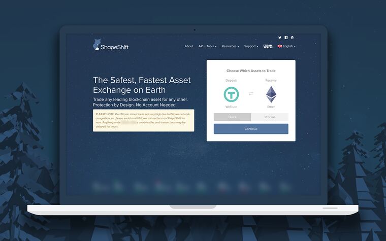
We never held the keys.
One of our first clients. Erik Voorhees wanted to move one crypto asset into another with no account and no order book, and we led the UI/UX and the front end build. Ten steps became one screen. One line never moved the whole decade: the company never touched customer key ownership.
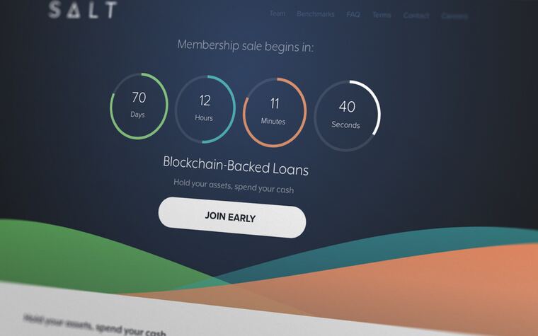
Launched out of our office. That happened twice.
Token sale first, then the funded build of a crypto-collateral lending platform in a crowded field. Phil served as fractional CTO through the launch into their own building and their own teams. A server built to live two months became the whole portal. When SALT took development inside, that was the plan working.
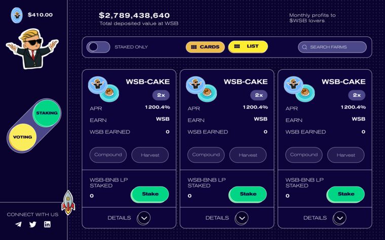
The machinery held. The crowd went elsewhere.
With synthetic-exchange partners we built early ETF rails for the WSB community: funds that could track almost anything, community-created funds, a token launch, a Diamond Hands event that beat every target. Then the community split behind different leaders and ran to the NFT craze instead of the heavy funds.
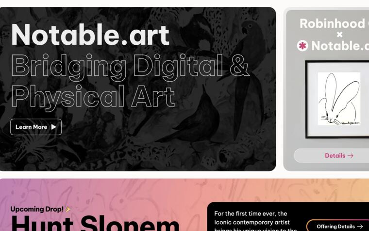
Right build. Late wave.
Twenty months taking a painter with a fifty-year career digital for the first time: 991 works, a rarity engine, a minting flow that took a credit card as easily as crypto. It arrived as the wave was breaking and the market moved toward prints.
Years later, the same founder called again.
Erik Voorhees wanted a cross-chain exchange for THORChain that ran straight off a KeepKey hardware wallet. Ten weeks, three milestones, a prototype dated December 18, 2020, and a code handoff the following April. It was a prototype and we call it that.
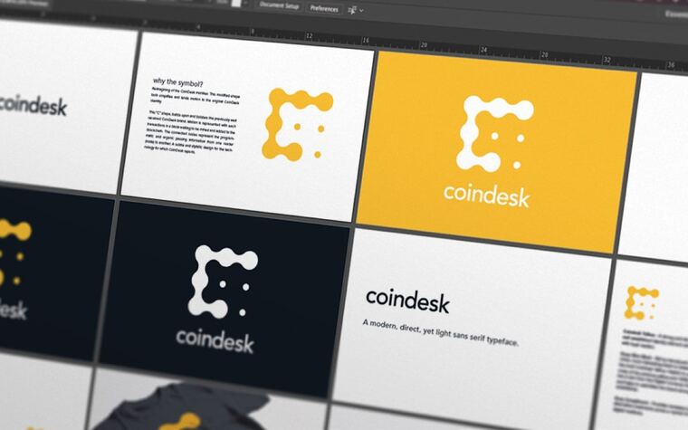
CoinDesk needed a visual identity.
In 2016 CoinDesk was a bitcoin news site with a conference attached. We drew the masthead, wrote the style guide through thirteen versions, designed the site, the app screens and the newsletter, and built the event brands for Consensus and Construct.
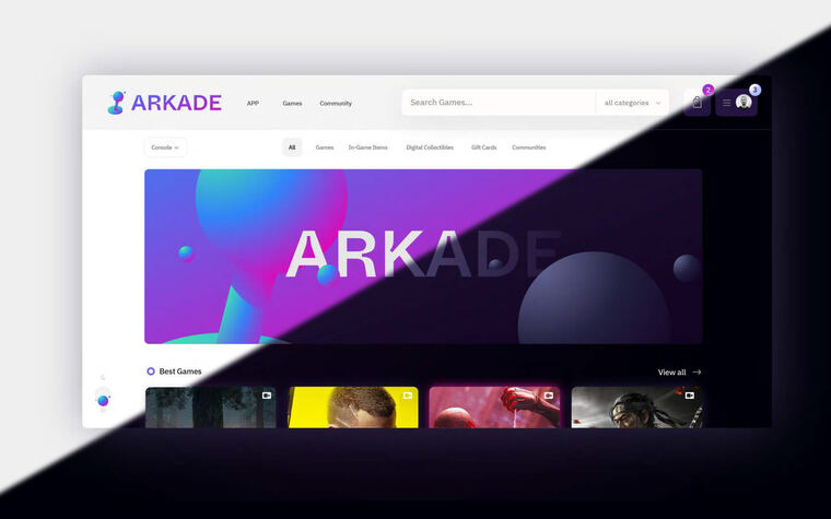
Build everything from scratch. Turn nothing off.
A game trading marketplace more than a decade old decided to start over. The old platform was buckling, and it was also where every order came from. We kept 1.0 patched and trading while rebuilding beside it, through to a working V1 demo in January 2022. LeapTrade became Arkade.
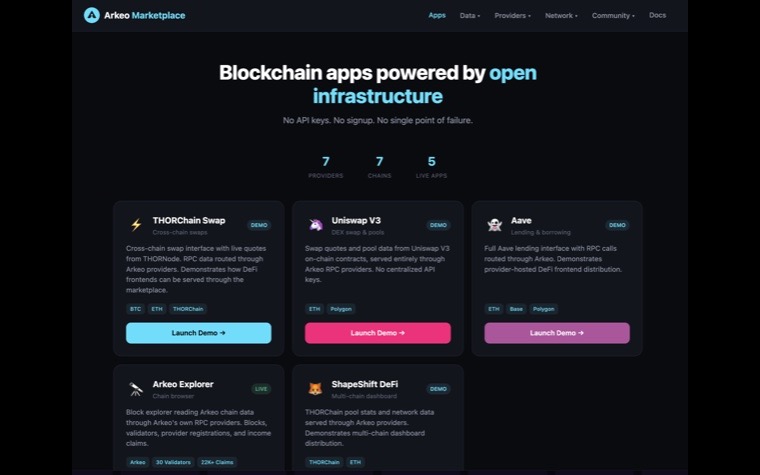
The chain, the marketplace, and an AI broker on top of it.
A blockchain and AI marketplace for on-chain data. We built and maintained the chain and the marketplace, resolved eighteen of eighteen third-party audit findings, and delivered an AI broker and subscriber system tied to the marketplace. All of it went live.
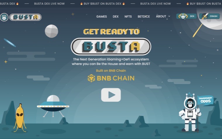
Six companies worked on the same game and database.
A gaming platform on Binance Smart Chain: a provably fair crash game, a token exchange with multi-route swaps and farming pools, an affiliate centre paying out on smart-contract referrals. We ran product, PM, DevOps and QA across six organisations. Four days of public failure, then 120 recorded production test runs.
Too expensive to build in 2021. It isn’t anymore.
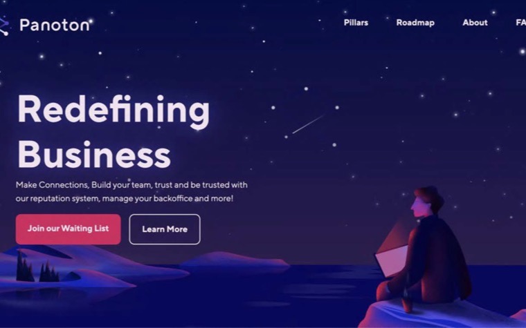
A blockchain-based gig platform, WeWork energy for distributed work. Strategy, brand, product design and technical scope, all four finished, and it reached prototype. The scope was ahead of its time and it held: we are adapting it now for the AI gig economy, for hybrid AI and human gig coordination, and for the x402 microtransaction settlement that 2021 had no way to pay for.
If you lose your key you’ve lost everything.
Phil’s own line, and the reason none of this was decoration. The work ran alongside ShapeShift: a brand system locking the lockups, the palette and the minimum sizes, then a white label device spec measured in millimetres, then a six step security check shown in sync on the desktop client and the device’s own screen.
One rebrand, five products.
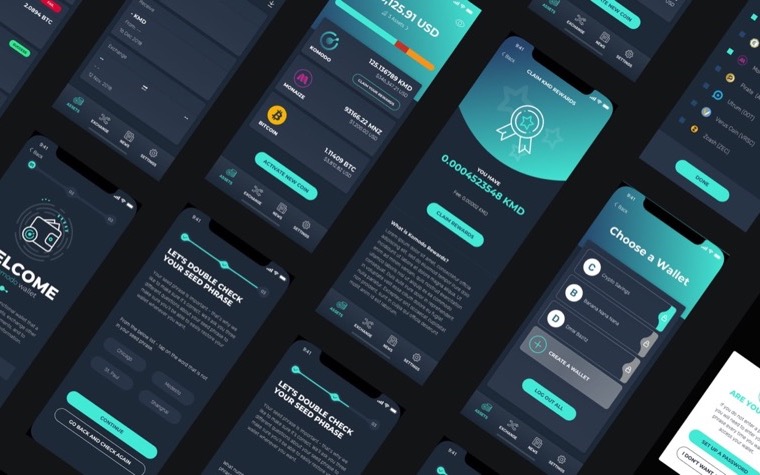
An open-source blockchain platform run by a pseudonymous founder and a team scattered from Helsinki to Sydney. We ran discovery, wrote the brand strategy, shipped an interim site, and designed the marketing site, the Agama mobile wallet and a blockchain generator. One rebrand carried across five products and a team in six time zones.
Share your internet with the neighborhood.
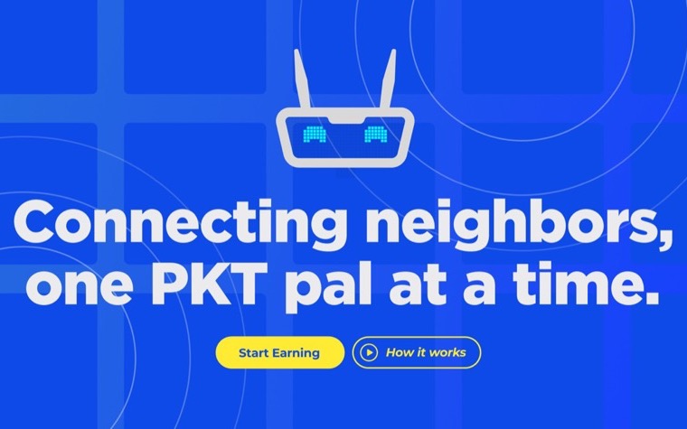
Three brothers in the wifi-sharing business: plug in a PKT Mini, share your connection, get paid. We ran the launch layer. Community and social from October 2022, then the January push, finishing the store’s web pages, QA alongside their devs, and the campaign for a pre-sale dated January 24, 2023.
The machine read the paper.
In 2017 the word was machine learning and the job was quieter than it sounds: let a student photograph a paper answer sheet and get a real score back. Fourteen tracked weeks that summer, ground truth built from filled SAT and PSAT sheets, a release build signed under our own bundle. A student photographed a paper answer sheet and got a real score back, in 2017.
Name the risks out loud, then give a verdict.
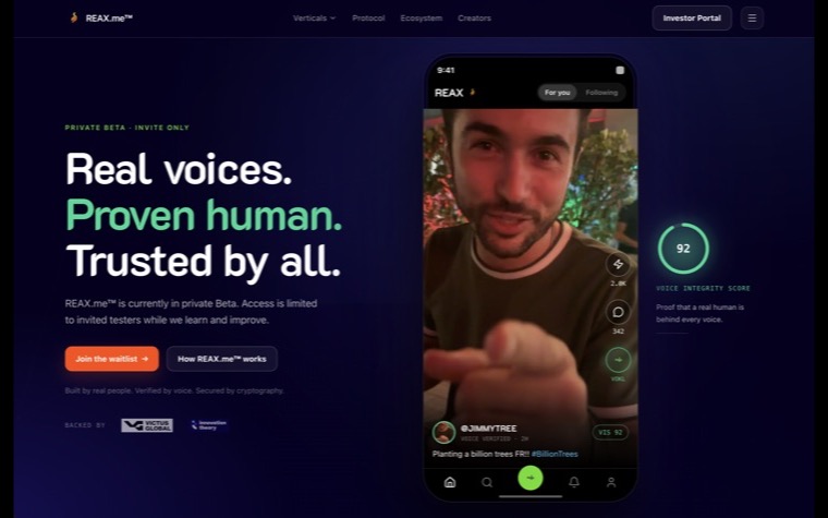
A client we are working with now. It began with an audit of an AI platform: the report named the risks, showed our reasoning, and gave the client a verdict and a timeline. Since then we have delivered the branding and the product scoping, and we are in continued growth with them: development, and the CTO role on our side of the table. The findings belong to them.
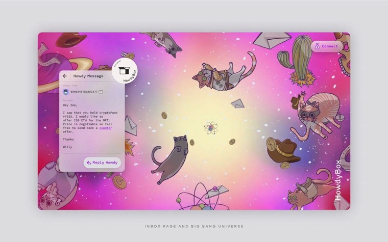
The brief called for weird, psychedelic and stoned.
An inter-blockchain messaging protocol for young crypto users, and the only brand we have written those adjectives into on purpose. The mark is a cat in a box, a multiverse traveller with a wild-west outlaw streak, drawn across a series so it could carry a meme. Naming, brand, illustration, UI and the pitch deck. Encrypted messaging across chains, built to prototype.
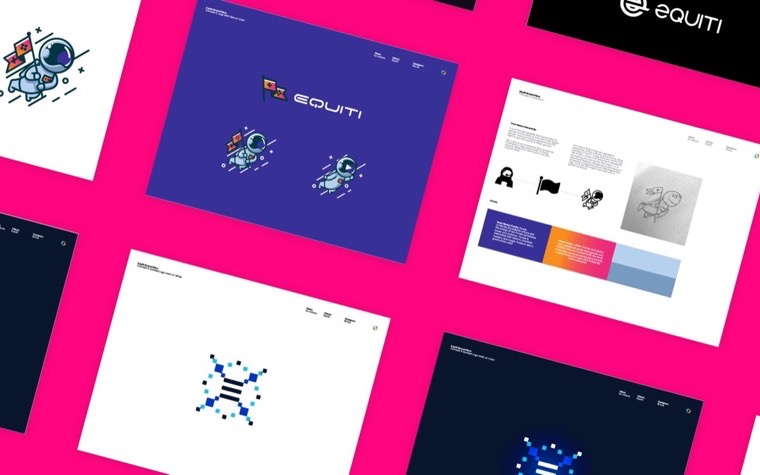
Steam, if players could fund the games.
A blockchain gaming marketplace where gamers stake in titles and pay for them before they exist, which is a funding model wearing a storefront. We built the identity and then the investor deck off the back of it, so the thing being pitched and the thing being sold looked like each other.
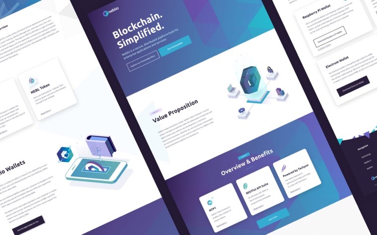
Dense metrics, made legible.
A blockchain data aggregator pulling live numbers off several networks at once. The brand had one job, which was to look like it could be trusted with a number: clean type, a tight palette, minimal iconography, nothing that decorates a chart. Then the site around it.
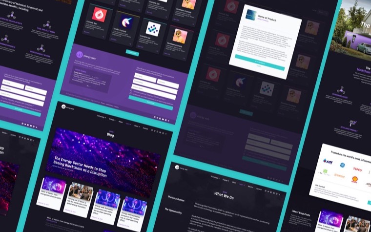
Blockchain, pointed at the grid.
A global nonprofit using open-source decentralised technology to move energy systems along, with utilities and grid operators in the room rather than traders. We refined the identity and built the site. Worth having on this wall because it is the same technology as everything above it, aimed at something that is not a market.
Transparency, speed, innovation. Their three words.
Crypto market data, the kind people check before they do anything else. Brand discovery first, then the mark, then it had to hold up across the web product and the mobile app. A logo for a price feed is a small surface with a lot riding on it.
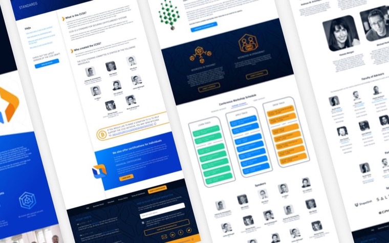
Certification is a trust business. So is a logo.
The CryptoCurrency Certification Consortium sets the standards the industry certifies professionals against. We ran brand discovery, drew the mark, and designed the site around certifications, resources and community. Nothing on it could look clever at the expense of looking credible.
Every great solution
started with a great idea.
Bring us yours. We can talk now, or send it over first and we’ll read it and tell you what we think, free, then talk. Either way is good.
Let’s talk